Rate This Ad allows a billboard designer to rate a billboard ad using the following scale: 1 (not good), 2 (below average), 3 (average), 4 (very good), 5 (great). Then the designer recommends how to improve the ad. This week’s rating is provided by Melody Roberts, an OBIE nominated billboard designer and founder of Out of Home Creative, an outdoor advertising design firm specializing in out of home design for businesses, agencies, media buyers and out of home companies. Melody has been in the outdoor industry since 2001. Insider uses and endorses her services.
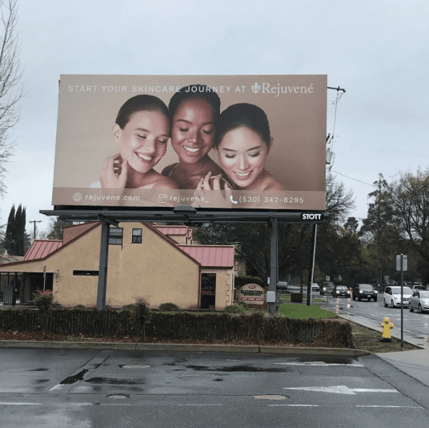
Rejuvené
Rating 2 (Below Average)
Please Note: For all ratings, I don’t know if a client insisted on certain elements or how much experience the designer had with out of home advertising. My recommendations requested by Billboard Insider are solely based on how I would have approached the creative design.
I’m guessing this is agency-provided art, and the client wanted to keep their advertising the same across all platforms, but as you can see, it doesn’t entirely work for OOH.
This brings me back to a recent Billboard Insider article I wrote on how important it is to discuss creative with your client on what will or won’t work for OOH and show them how slight modifications are necessary for our medium. I don’t know if the OOH company presented alternatives for better OOH visuals, but I would have shown a side-by-side comparison with the changes listed below and something slightly different using the same models. Taking this extra step shows the client you’re just as invested in their ROI as they are. And clients will likely go with the version that works better for OOH. You can still use their elements to stay on brand, but in our industry, not everything translates well from online or print to a billboard.
- I like the image; it shows diversity, and at a glance, I can assume it has something to do with skincare.
- The issue is the bottom banner information and readability of the top copy. A business doesn’t need to have all its contact information on a billboard. I encourage clients not to put their phone numbers on outdoor structures unless it’s a vanity number. Many states are hands-free, and it’s easier to remember a business or website’s name than a number. People will Google a company for more details.
- I would take “at” out of the tagline, stack it flush Left with the logo underneath. Flip the image so the darker background is on the Left and people read Left to Right. If it needed more contrast for better readability, I would darken the background vs. a drop shadow to keep it clean. I would not put the bottom information on the Poster.
[wpforms id=”9787″]
Paid Advertisement
