


Rate This Ad allows a billboard designer to rate a random piece of billboard artwork using the following scale: 1 (not good), 2 (below average), 3 (average), 4 (very good), 5 (great). Then the designer talks about what they may have done differently for outdoor advertising. This week’s rating is provided by Greg Callaham www.gregcallaham.com) who has 30 years of experience in outdoor advertising design. Insider has used and endorses Callaham’s services.
I got my shot
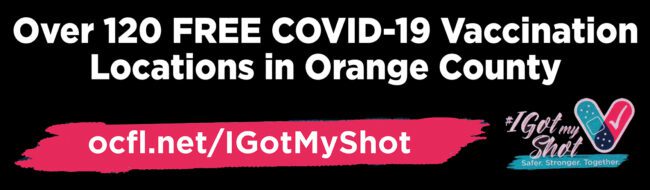
Rating: 2 (below average)
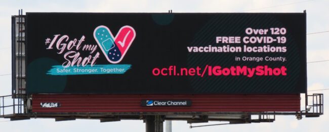
- The message of this billboard is incredibly vital to the health of the target market. That is why it is so disappointing for the communication of that message to be nearly stifled by the design.
- An overly busy logo competes with the web address for the viewer’s attention while the main idea is typeset in the smallest two text sizes in the ad.
- The legibility of the web address is compromised by the red text on a black background. That does not read well on printed vinyl.
- This ad earns a 2 (below average).
As always, I do not know the particulars of the art request or components of the campaign this ad may or may not have been part of. But looking at this challenge with the eye of an OOH graphic designer and through the lens of the target audience, I would have urged the advertiser to run the ad pictured below:
- The main selling message is set in large, high-contrast text for easy reading and understanding.
- The web address is set in large white letters inside a bright red swoosh graphic to draw the eye and echo the same graphic in the logo.
- The logo is smaller and positioned in the lower right. It’s the last thing the eye sees as it travels across the message.
[wpforms id=”9787″]
Paid Advertisement