


Rate This Ad allows a billboard designer to rate a random piece of billboard artwork using the following scale: 1 (not good), 2 (below average), 3 (average), 4 (very good), 5 (great). Then the designer talks about what they may have done differently for outdoor advertising. This week’s rating is provided by Greg Callaham www.gregcallaham.com) who has 30 years of experience in outdoor advertising design. Insider uses and endorses Callaham’s services.
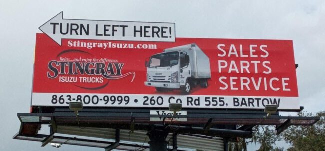
Stingray Isuzu
Rating: 2 (Below Average)
- Editing is very difficult for some advertisers. It’s understandable because it’s their business on the board and they are writing the monthly check. They feel like everything on the business card must be included plus some extra information, so nothing is left to chance. That’s when the account executive and the designer need to capitalize on the foundation they’ve laid firmly establishing themselves as experts in outdoor advertising, and guide the advertiser as trusted advisors through the potentially painful process of editing.
- The red does a good job of attracting the eye, but then the target audience doesn’t know what to look at first. Everything is competing for their attention. The result is confusion.
- The advertiser included four different ways to locate or contact the business. That has an additional negative impact on legibility because contact info is scattered all over the place.
- It earns a 2 (below average).
I do not know the particulars of the art request or components of the campaign, but I would have urged the advertiser to run this ad:

The red still draws the eye, but it gets an assist from the yellow arrow, which emphasizes the business name and visually communicates the direction to turn. The top corner of the truck also attracts attention by breaking the top plane of the ad and allows the product to be larger and centered. Contact info is reduced to the easy-to-remember phone number and the web site, where all the other directional info can be found. Finally, the text on the right is much larger and a drop shadow had been added for a little extra pop.
[wpforms id=”9787″]
Paid Advertisement