


Rate This Ad allows a billboard designer to rate a random piece of billboard artwork using the following scale: 1 (not good), 2 (below average), 3 (average), 4 (very good), 5 (great). Then the designer talks about what they may have done differently for outdoor advertising. This week’s rating is provided by Greg Callaham www.gregcallaham.com) who has 30 years of experience in outdoor advertising design. Insider uses and endorses Callaham’s services.
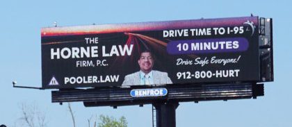
Horne Law Firm
Rating: 2 (Below Average)
- There is a lot competing for the attention of the viewer in this ad and, to be fair, a little bit of it works.
- The words “Horne Law” do stand out and are large enough to be read across four lanes of traffic. That’s the part that works. Everything else is borderline legible or worse.
- The contact info is a bit small and divided by a photo.
- The main message seems to be about how well traffic is flowing, yet that info is a bit small and in all-caps, increasing the reading difficulty.
- The friendly reminder is in very small script, making its inclusion in the design questionable.
- Two small logos in opposite corners distract more than inform. I presume the background photo of headlight and taillight streaks is meant to convey that the advertiser is an attorney focused on auto injury cases. However, the placement of his photo leaves him standing in the middle of the road and the viewer wondering why.
- The background photo is either flipped or does not depict an American traffic pattern, which is another distraction. So, there is far too much going on causing design challenges that interfere with the transmission of the message.
- The better course would have been to either make the board a friendly, expected drive time message with a “brought to you by…” line of text, or make it an ad for the law firm with a traffic accident focus.
- This billboard earns a 2 (below average).
[wpforms id=”9787″]
Paid Advertisement